


PRINT, TYPE DESIGN, ARTIFACT
Steinbeck
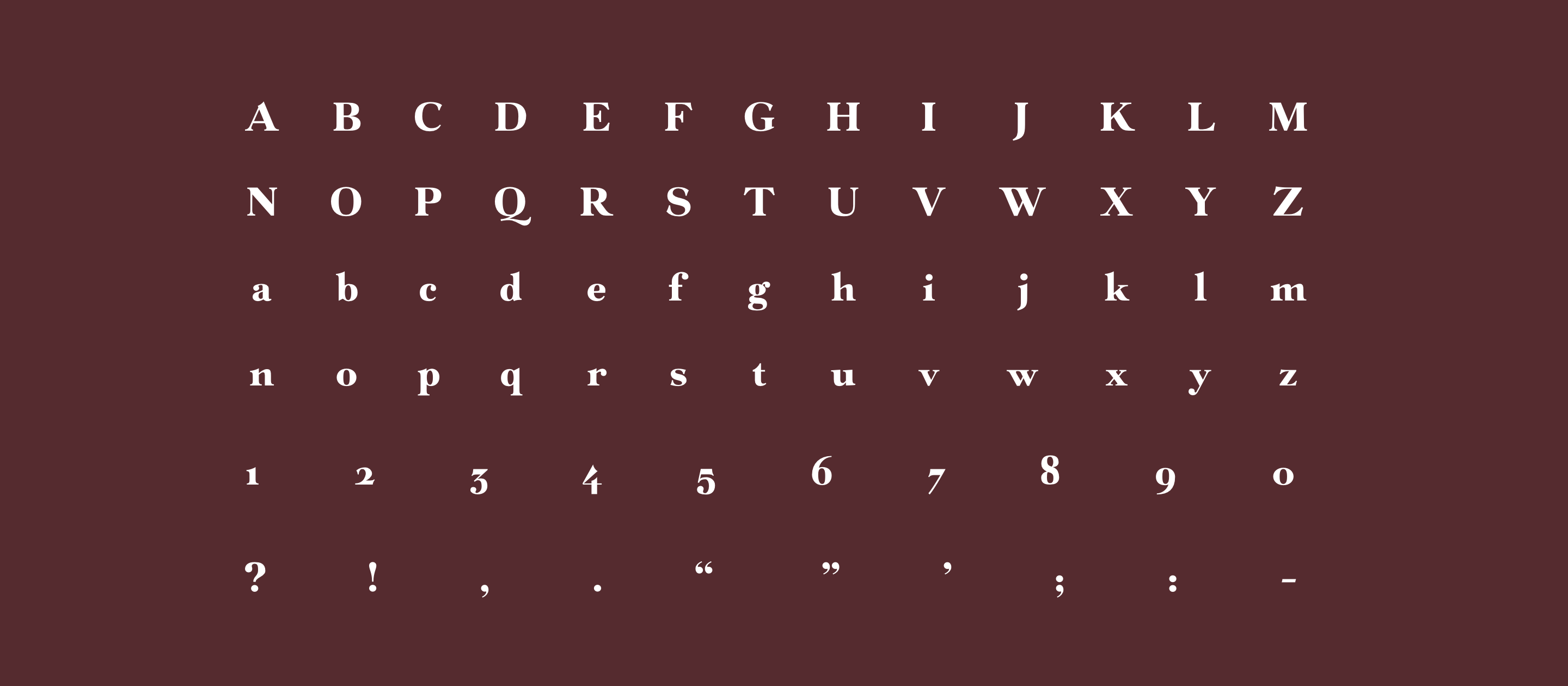
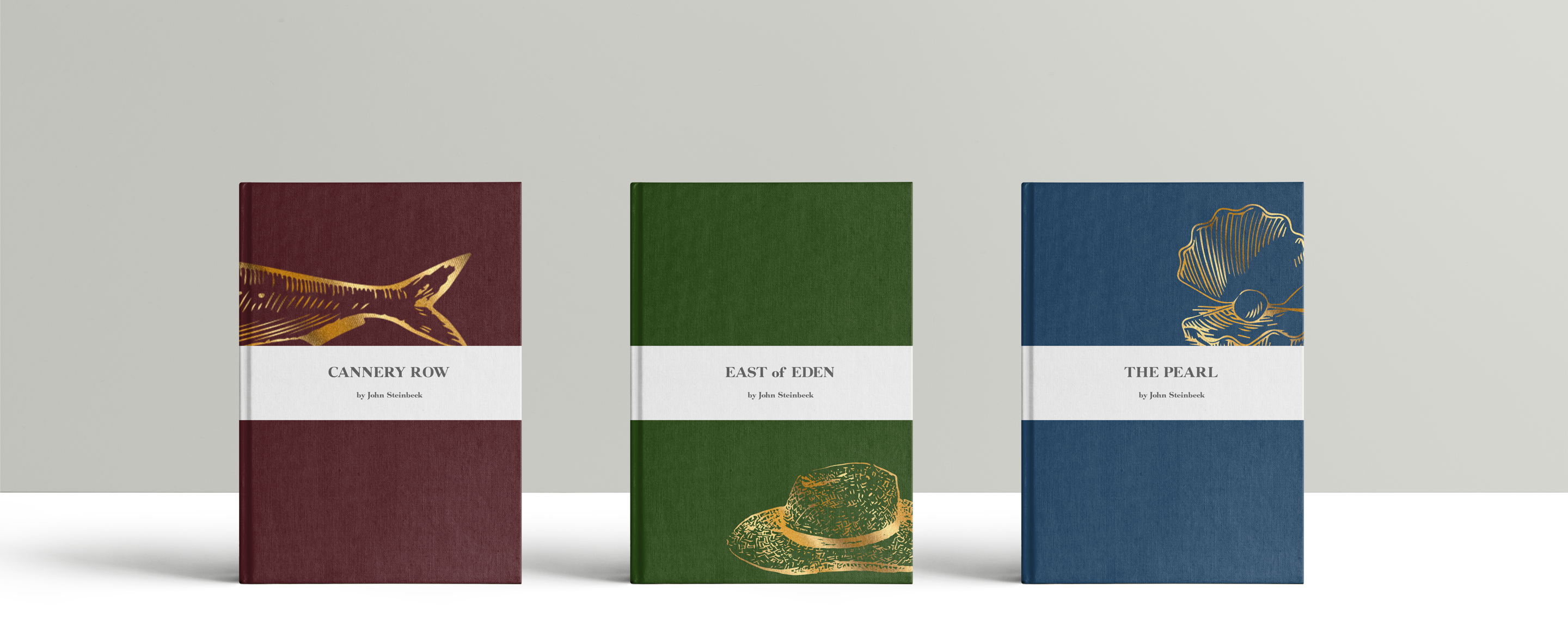
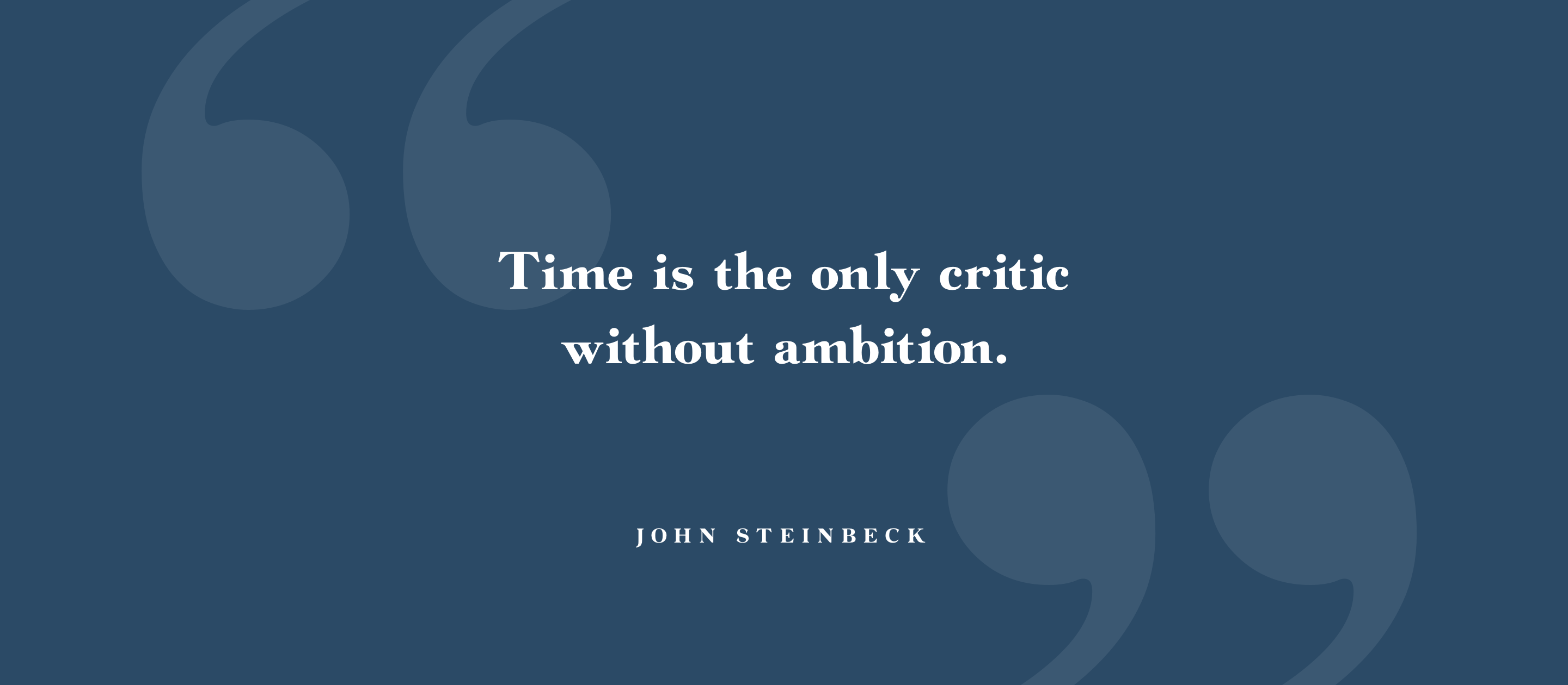
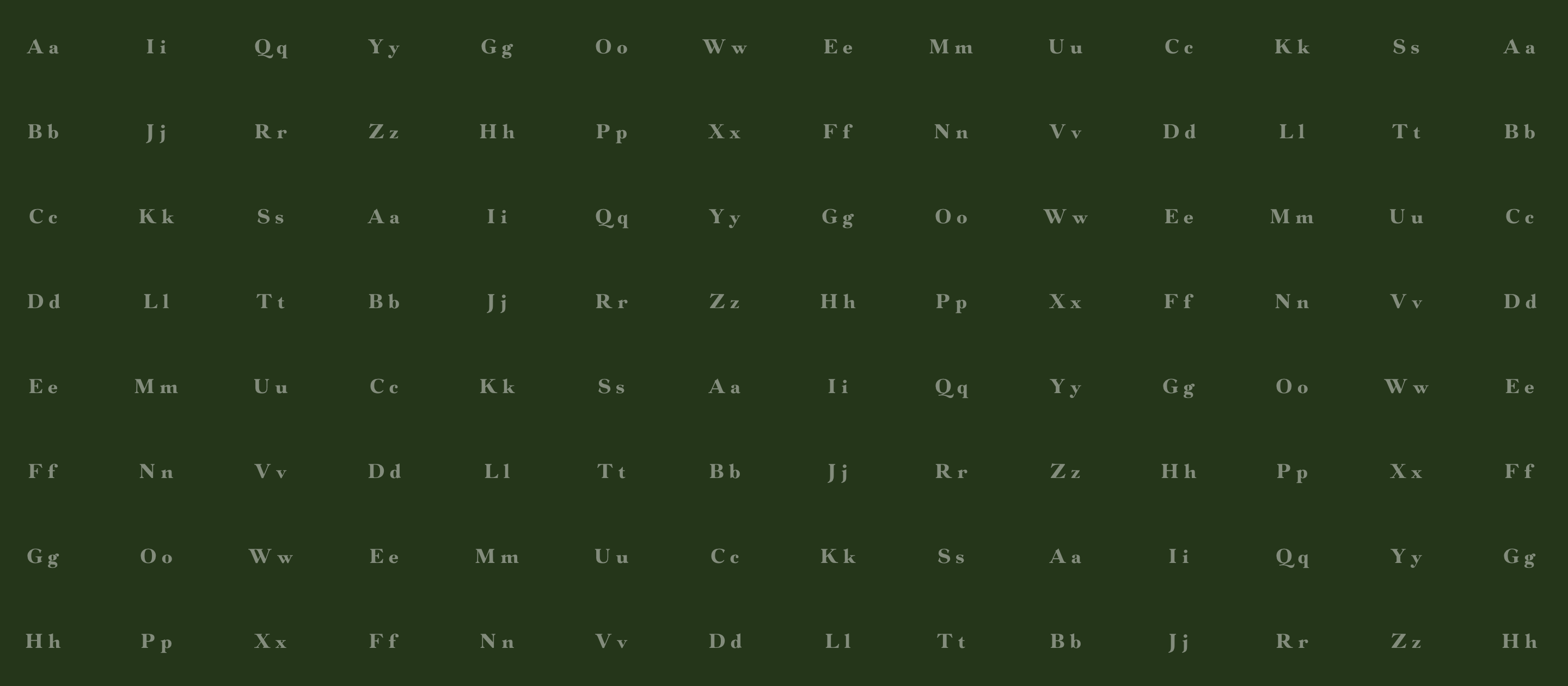
John Steinbeck is my favorite author for the incredible scenes he forms. His writing has a distinguishable rythm to it, and he controls the pace of each story like a maestro. Steinbeck Heavy, my typeface, was created to capture the personality of the author and to reflect the illustrative nature of his writing.
It is a transitional font with neoclassical proportions and an upright, honest feel. Not to be used for long copy, Steinbeck is intended to grace the cover of books. It partners well with fonts that have a tall x-height for reading, such as Tschichold's Sabon and most sans-serif fonts with Grotesque proportions.
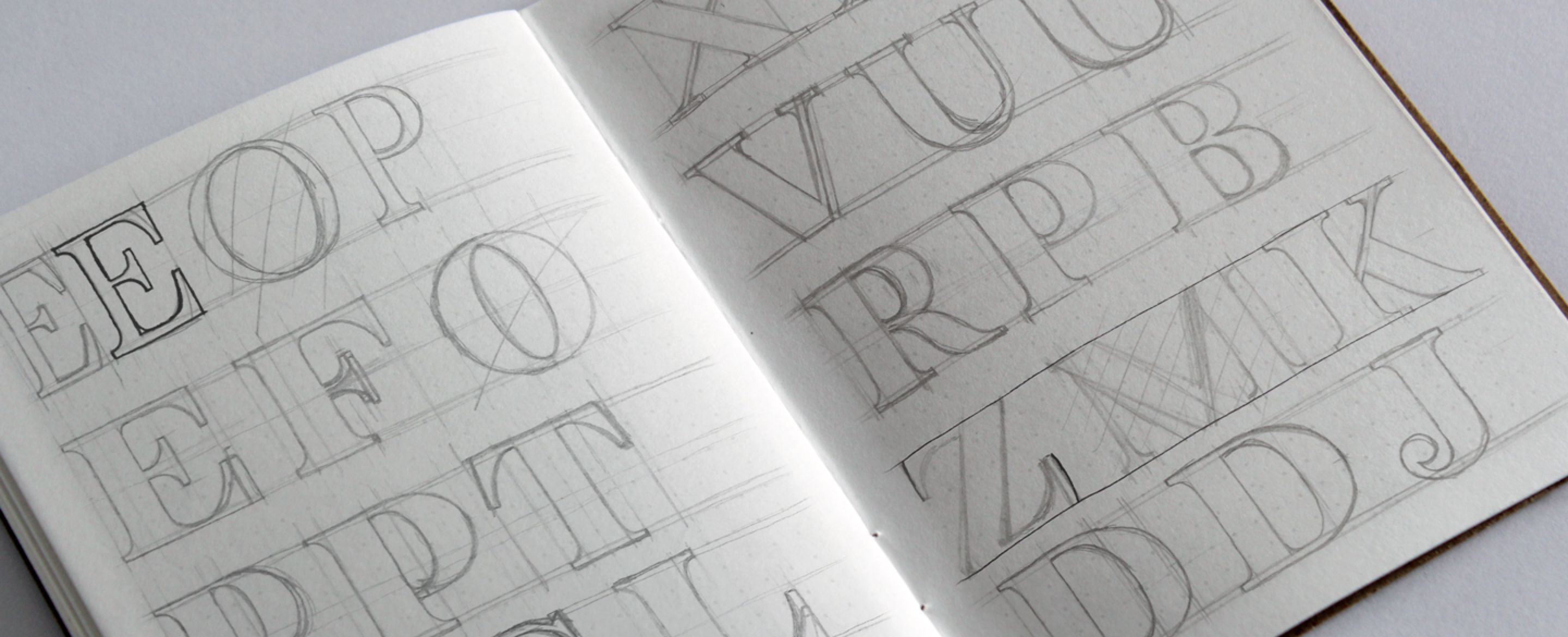
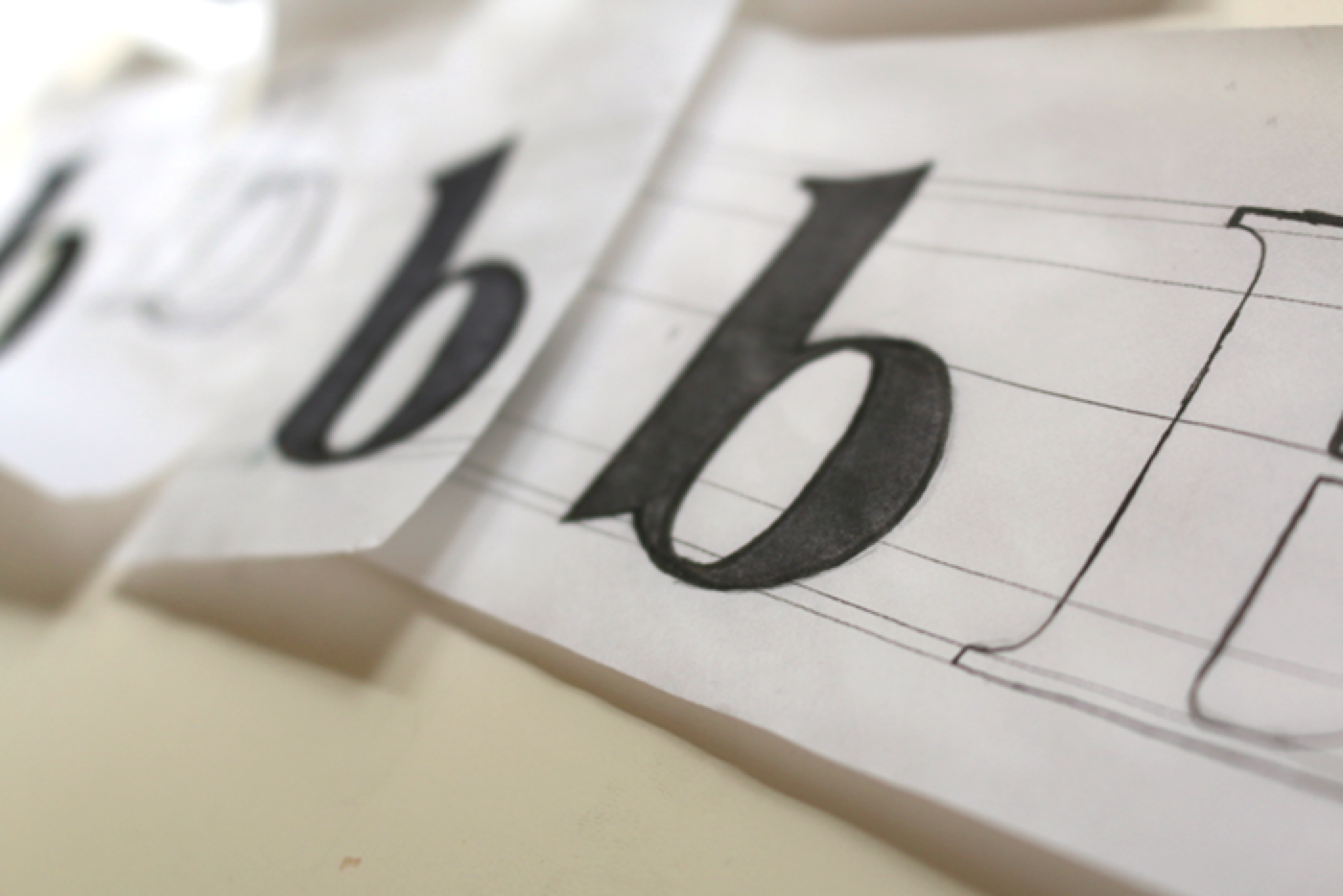
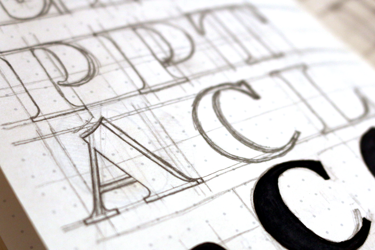
The concept for Steinbeck began as some sketches in a notebook at the lake; a setting that he himself could describe far better. The initial shape of the letters was drawn to harken Baskerville's letterforms. As I spent more time sketching the letterforms and creating a balanced looking alphabet, I started to make it more my own by increasing the stroke contrast, making terminals more dramatic, and infusing it with Didone geometry.